Having made a style sheet to improve the usability of the incoming new Inbox page, I've been working on a similar modification for the new Create Entries page. I'm afraid this was a challenge! Unlike with the Inbox, where the changes are mostly just aesthetic and can be fixed aesthetically, here the structure of the page has changed too much for me to be able to make it look the way the old Post page looks. Therefore I've concentrated on fixing the aspects of the new page that were making it unpleasant and difficult for me to use—making things generally smaller, plainer, more clearly-demarcated and less blocky—rather than trying to imitate the appearance of the old page.
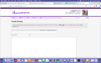
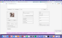
I've been fiddling with this for weeks now, and I think I've achieved about as much as I can. Here is what it looks like (click for full size):


And here is the code. See my post on the Inbox fix for instructions on how to use the style sheet; set it to apply to URLs starting with
This was designed for use with the Tropospherical (Red or Purple) site skins and may not work perfectly with others. The lines between /* */ are comments describing what each part of the code does, so if there's anything you don't want to change, simply remove the relevant section of code.
One especially important point: I know that the inability to put the icon selector above the entry text, where it is at the moment, is a particular problem with the new page for many people (me included!). I can't figure out any way to put it back there. Some people find that putting it in a sidebar, which you can do using the Rearrange Panels button, is better than having it at the bottom, and it would be more so if you could have the sidebar on the left instead of the right. I've included a piece of code which puts the sidebar on the left if you have one; but I haven't got one here. The narrow margins of the new page are a particular problem for me, and I found while fiddling about with the CSS that out of 1) giving the entry text box wide enough margins not to feel overwhelming, 2) making it wide enough to write in conveniently and 3) having enough horizontal space for a sidebar, I had to pick two, and 3) was the lowest priority! If you do want a sidebar, you will probably have to adjust the margins to make it work.
An outstanding problem: I wanted to move the panels at the bottom closer together, but can't figure out how (I expected to be able to do this by making some element's margin smaller, but either I can't identify which one or the space is something other than a margin that I don't understand). —ETA: I have now fixed this (by working around whatever the issue with margins was), and the code above is updated to include it. Thanks to ![[personal profile]](https://www.dreamwidth.org/img/silk/identity/user.png) dianafortyseven for help!
dianafortyseven for help!
If you can solve either of the above problems, or otherwise have any additional points of CSS expertise which you would like to contribute, please let me know!
I hope this is helpful! This is a bigger, more complicated project than the Inbox style, and I expect there are various errors in there; if anything about it isn't working for you, let me know and I'll see what we can do to fix it. :)
I've been fiddling with this for weeks now, and I think I've achieved about as much as I can. Here is what it looks like (click for full size):


And here is the code. See my post on the Inbox fix for instructions on how to use the style sheet; set it to apply to URLs starting with
https://www.dreamwidth.org/entry.Click here to see the code
/* Widens margins */
#page {
    margin: auto 10%;
    width: 80%;
}


/* Gives the entry text box a darker border, widens its right margin */
#entry-body {
    border: 1px solid rgb(118,118,118);
    margin: 0 15% 0 0;
    width: 85%;
}


/* Fixes the 'create poll'/'rearrange panels' menu, subject box and text editor type dropdown: darkens borders, widens margins, reduces font size, reduces height */

.toolbar-container {
    margin: 0 40% 0 0 ;
    width: 60%;
    border: 1px solid rgb(133,133,133);
    font-size: 75%;
}

.panel {
    border: none;
}

.panel.radius {
    border-radius: 0;
}

.subject-container {
    margin: 0 40% 0 0 ;
    width: 60%;
}

#id-subject-0 {
    border: 1px solid rgb(133,133,133);
    border-top: none;
    font-size: 75%;
    line-height: 1;
    height: 25px;
    padding: 2px;
}

.markup-container {
    margin: 0 75% 0 0 ;
    width: 25%;
}

#editor {
    font-size: 75%;
    height: 25px;
    padding: 2px;
}


/* Gets rid of placeholder text in the entry text box and title box */

::placeholder {
    display: none;
    color: white;
}


/* Reduces font size in the text entry box */

#canvas .current-entry textarea {
    font-size: medium;
}


/* Puts the sidebar, if you have one, on the left. Credit and thanks to a kind anon who provided this code! */

@media only screen and (min-width: 64.0625em) { .entry-partial-width .current-entry { float:right; } }


/* Gives buttons a plainer appearance */

.button {
    height: 20px;
    background-color: #efefef;
    color: black;
    border: 1px solid grey;
    padding: 0 1em;
    cursor: auto;
    transition: none;
    float: right;
    box-shadow: none;
}

.button:hover {
    background-color: #e5e5e5;
    color: black;
    cursor: auto;
}

.panel .button.secondary:hover, .panel button.secondary:hover {
    color: black;
}

.panel .button.secondary, .panel button.secondary, #canvas .entry-quick-actions li:last-of-type .button, .submit {
    padding: 2px;
    height: 20px;
    background-color: #efefef;
    color: black;
    border: 1px solid grey;
    cursor: auto;
    transition: none;
    float: right;
    box-shadow: none;
    margin-left: 1em;
    font-size: 75%;
}

#canvas .entry-quick-actions li:last-of-type .button:hover, .panel .button.secondary:hover, .panel button.secondary:hover, .submit:hover {
    background-color: #e5e5e5;
    color: black;
    cursor: auto;
}

#canvas .component button {
    font-size: 75%;
}

.button.logout {
    height: 20px;
    background-color: #efefef;
    color: black;
    border: 1px solid grey;
    cursor: auto;
    transition: none;
    border-radius: 2px;
}

.button.logout:hover {
    background-color: #e5e5e5;
    color: black;
}

#canvas .entry-quick-actions .fancy-select-output {
    height: 25px;
    font-size: 75%;
    padding: 6px 2em 0 2em;
    margin-top: 1em;
    margin-left: 10px;
    border: 1px solid rgb(118,118,118);
    color: black;
    background-color: #efefef;
}

#canvas .fancy-select {
    margin-left: 1px;
    height: 25px;
}

#canvas .entry-quick-actions li:last-of-type .button {
    height: 25px;
    width: 150px;
    padding-bottom: 3px;
    padding-left: 3px;
}

#canvas .entry-quick-actions output {
    margin-right: 3em;
    vertical-align: auto;
    margin-top: 0;
}

#canvas .entry-quick-actions input {
    margin-right: 140px;
}

#canvas .entry-quick-actions li:first-of-type input {
    border-top-left-radius: 0 !important;
    border-bottom-left-radius: 0 !important;
}

#canvas .entry-quick-actions li:last-of-type .button {
    border-top-right-radius: 0 !important;
    border-bottom-right-radius: 0 !important;
}

#js-preview-button {
    margin-top: 1em;
}

.picker__button--today {
    padding: 0;
    height: 20px;
    background-color: #efefef;
    color: black;
    border: 1px solid grey;
    cursor: auto;
    transition: none;
    float: right;
    box-shadow: none;
}

.picker__button--today:hover, .picker__list-item:hover {
    background-color: #e5e5e5;
    color: black;
}

.picker__year, .picker__month, .picker__weekday, .picker__day, .icon-browser-options, .icon-browser-options label, .icon-browser button, .submit {
    font-size: 75%;
}

.picker__list-item {
    font-size: 75%;
}

.tag-browser-content label {
    font-size: 75%;
}

.medium-2 label {
    font-size: 75%;
}

#js-tag-browser-select {
    height: 20px;
    background-color: #efefef;
    color: black;
    border: 1px solid grey;
    cursor: auto;
    transition: none;
    float: right;
    box-shadow: none;
    padding: 2px;
}

#js-tag-browser-select:hover {
    background-color: #e5e5e5;
}

#js-tag-browser-search {
    border: 1px solid #767676;
    transition: none;
    width: 10em;
    height: 1.75em;
    font-size: 75%;
}

.reveal-modal .close-reveal-modal {
    color: black;
    font-size: 75%;
}


/* Gets rid of the word 'Browse' and white gradient covering the bottom of your icon */
.block-icon button::after {
    content: none;
    background: none;
}


/* Returns the top banner to its old appearance */

#masthead {
    height: 7em;
    border-top: 0.45em solid #f4d2fc;
}

@media only screen and (min-width: 40.0625em) { #account-links ul {
    font-size: 75%;
    }}

@media only screen and (min-width: 40.0625em) {
#account-links .ljuser {
    font-size: 100%;
    }}


/* Reduces font size of the header */

h1 {
    font-size: 1.5em;
}


/* Fixes the top bar lists */

.top-bar-section ul li>a {
    font-size: 75%;
}

@media only screen and (min-width: 40.0625em) { .top-bar-section .has-dropdown>a:after {
    display: none;
}}

.nav-search select {
    font-size: 75%;
    background-color: white;
}

.top-bar-section .dropdown {
    min-width: 12em;
}


/* Returns the search box to its old appearance */

#search {
    border: 1px solid #767676;
    transition: none;
    border-radius: 2px;
    width: 15em;
    height: 1.75em;
}

#search:hover {
    border: 1px solid #4f4f4f;
}


/* Makes the panels look less blocky: gives them a border, narrows them, makes text smaller */

#canvas .component {
    font-size: 70%;
}

#canvas .component h3 {
    font-size: 100%;
}

.panel.component {
    border: 1px solid rgb(118,118,118);
    width: 250px;
    background-color: #efefef;
}

.first-column, .second-column, .third-column {
    margin-top: 1em;
    width: 250px;
}

#canvas .component select {
    font-size: 100%;
    height: 25px;
    padding: 2px;
}

#canvas .component input, #canvas .component label {
    font-size: 100%;
}

.ui-corner-all {
    font-size: 85%;
}

.ui-menu a:hover {
    background-color: rgb(240,240,240);
    color: black;
}

.autocomplete-container {
    padding: 2px;
    height: 25px;
}

#autocomplete_js-taglist_count {
    font-size: 100%;
    font-weight: normal;
    color: black;
    background-color: #efefef;
}

.row .components-columns {
    width: 775px;
    margin-left: 0;
}


/* Gets rid of the redundant extra Post button immediately below the entry text. If you prefer this button and would like instead to get rid of the Post button at the bottom, change '.no-bullet input' to '.button.left'. */

.no-bullet input {
    display: none;
}


/* Hides the 'autosaved draft' text */

#draftstatus {
    display: none;
}
This was designed for use with the Tropospherical (Red or Purple) site skins and may not work perfectly with others. The lines between /* */ are comments describing what each part of the code does, so if there's anything you don't want to change, simply remove the relevant section of code.
One especially important point: I know that the inability to put the icon selector above the entry text, where it is at the moment, is a particular problem with the new page for many people (me included!). I can't figure out any way to put it back there. Some people find that putting it in a sidebar, which you can do using the Rearrange Panels button, is better than having it at the bottom, and it would be more so if you could have the sidebar on the left instead of the right. I've included a piece of code which puts the sidebar on the left if you have one; but I haven't got one here. The narrow margins of the new page are a particular problem for me, and I found while fiddling about with the CSS that out of 1) giving the entry text box wide enough margins not to feel overwhelming, 2) making it wide enough to write in conveniently and 3) having enough horizontal space for a sidebar, I had to pick two, and 3) was the lowest priority! If you do want a sidebar, you will probably have to adjust the margins to make it work.
If you can solve either of the above problems, or otherwise have any additional points of CSS expertise which you would like to contribute, please let me know!
I hope this is helpful! This is a bigger, more complicated project than the Inbox style, and I expect there are various errors in there; if anything about it isn't working for you, let me know and I'll see what we can do to fix it. :)