regshoe: Redwing, a brown bird with a red wing patch, perched in a tree (Default)
I watched Kidnapped again yesterday, on the anniversary of its first performance last year. It doesn't dim with rewatching; I was a little afraid it would, but just hearing that opening guitar-strum still takes me right back to that moment in the theatre, thinking, right, this is happening... :)

I ended up turning my semi-break from fandom into a mostly-disappearance, for which apologies. RL has been going pretty well if busily, about which I may write more in another post. Fandom has been difficult, and I've had a bit of thinking to do about where I am and what I should do from here; I've decided that on the one hand I should stick to a somewhat-reduced level of activity for the foreseeable future, but on the other hand I do want to stay here at least that much. So I've also been thinking about how I might make that work, principally by avoiding as completely as possible the things I need to avoid. AO3 Saviour has been a great help ever since I started using it, and I've extended my blocklist there; what would be really useful is if I had something similar for Dreamwidth, and so—

A request for help with JavaScript )

(Other stuff: I will probably stop going on Tumblr; and I won't do Write Every Day check-ins anymore, though I will try to keep up with the spirit of it.)

In the meantime, I've been writing! I have four WIPs (for three different Kidnappeds and Jill) in various states of almost ready to post; I was vaguely planning to return to them over the Easter weekend, but Good Friday is here and I'm deep into a new WIP which is so absorbing I might just keep going on that until the first draft is done, so the others might have to wait a little while longer. (On the other hand, one of them is for NTS Kidnapped and the new WIP isn't, so I might harness the fresh-rewatch energy to finish editing that one... we'll see.)

On that topic, [personal profile] verecunda tagged me a while ago on Tumblr in a 'post the last sentence you wrote' meme, which seems a good excuse for a snippet...
But that last morning in the Cage upon Ben Alder, and through all the hard, miserable days that followed, I think I never quite got out of that bad dream; until— I will tell what happened.
(Not as interesting out of context as in, but perhaps you can tell why I'm reluctant to stop there.)

I've also got quite a bit of new fic to read, which looks very good indeed—I've read a couple this morning and am looking forward to making my way slowly through the rest. :) And I've kept up writing (short) book reviews, without posting them, so I may have an unusually long Recent Reading entry to make at some point. Right now I'm reading another Hornblower book (which finally turned up at the library after having it on hold for three months), which, oh dear... However I am also re-reading Kidnapped as inspiration for that WIP, which is not exactly conducive to concentrating on Hornblower, so it might be a little while before I find out whether
spoilerBush really is dead after all.
And while re-reading Kidnapped I am making notes for a timeline, which is being a fun project!
regshoe: Redwing, a brown bird with a red wing patch, perched in a tree (Default)
Having made a style sheet to improve the usability of the incoming new Inbox page, I've been working on a similar modification for the new Create Entries page. I'm afraid this was a challenge! Unlike with the Inbox, where the changes are mostly just aesthetic and can be fixed aesthetically, here the structure of the page has changed too much for me to be able to make it look the way the old Post page looks. Therefore I've concentrated on fixing the aspects of the new page that were making it unpleasant and difficult for me to use—making things generally smaller, plainer, more clearly-demarcated and less blocky—rather than trying to imitate the appearance of the old page.

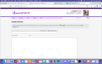
I've been fiddling with this for weeks now, and I think I've achieved about as much as I can. Here is what it looks like (click for full size):


And here is the code. See my post on the Inbox fix for instructions on how to use the style sheet; set it to apply to URLs starting with https://www.dreamwidth.org/entry.

Click here to see the code


/* Widens margins */
#page {
margin: auto 10%;
width: 80%;
}


/* Gives the entry text box a darker border, widens its right margin */
#entry-body {
border: 1px solid rgb(118,118,118);
margin: 0 15% 0 0;
width: 85%;
}


/* Fixes the 'create poll'/'rearrange panels' menu, subject box and text editor type dropdown: darkens borders, widens margins, reduces font size, reduces height */

.toolbar-container {
margin: 0 40% 0 0 ;
width: 60%;
border: 1px solid rgb(133,133,133);
font-size: 75%;
}

.panel {
border: none;
}

.panel.radius {
border-radius: 0;
}

.subject-container {
margin: 0 40% 0 0 ;
width: 60%;
}

#id-subject-0 {
border: 1px solid rgb(133,133,133);
border-top: none;
font-size: 75%;
line-height: 1;
height: 25px;
padding: 2px;
}

.markup-container {
margin: 0 75% 0 0 ;
width: 25%;
}

#editor {
font-size: 75%;
height: 25px;
padding: 2px;
}


/* Gets rid of placeholder text in the entry text box and title box */

::placeholder {
display: none;
color: white;
}


/* Reduces font size in the text entry box */

#canvas .current-entry textarea {
font-size: medium;
}


/* Puts the sidebar, if you have one, on the left. Credit and thanks to a kind anon who provided this code! */

@media only screen and (min-width: 64.0625em) { .entry-partial-width .current-entry { float:right; } }


/* Gives buttons a plainer appearance */

.button {
height: 20px;
background-color: #efefef;
color: black;
border: 1px solid grey;
padding: 0 1em;
cursor: auto;
transition: none;
float: right;
box-shadow: none;
}

.button:hover {
background-color: #e5e5e5;
color: black;
cursor: auto;
}

.panel .button.secondary:hover, .panel button.secondary:hover {
color: black;
}

.panel .button.secondary, .panel button.secondary, #canvas .entry-quick-actions li:last-of-type .button, .submit {
padding: 2px;
height: 20px;
background-color: #efefef;
color: black;
border: 1px solid grey;
cursor: auto;
transition: none;
float: right;
box-shadow: none;
margin-left: 1em;
font-size: 75%;
}

#canvas .entry-quick-actions li:last-of-type .button:hover, .panel .button.secondary:hover, .panel button.secondary:hover, .submit:hover {
background-color: #e5e5e5;
color: black;
cursor: auto;
}

#canvas .component button {
font-size: 75%;
}

.button.logout {
height: 20px;
background-color: #efefef;
color: black;
border: 1px solid grey;
cursor: auto;
transition: none;
border-radius: 2px;
}

.button.logout:hover {
background-color: #e5e5e5;
color: black;
}

#canvas .entry-quick-actions .fancy-select-output {
height: 25px;
font-size: 75%;
padding: 6px 2em 0 2em;
margin-top: 1em;
margin-left: 10px;
border: 1px solid rgb(118,118,118);
color: black;
background-color: #efefef;
}

#canvas .fancy-select {
margin-left: 1px;
height: 25px;
}

#canvas .entry-quick-actions li:last-of-type .button {
height: 25px;
width: 150px;
padding-bottom: 3px;
padding-left: 3px;
}

#canvas .entry-quick-actions output {
margin-right: 3em;
vertical-align: auto;
margin-top: 0;
}

#canvas .entry-quick-actions input {
margin-right: 140px;
}

#canvas .entry-quick-actions li:first-of-type input {
border-top-left-radius: 0 !important;
border-bottom-left-radius: 0 !important;
}

#canvas .entry-quick-actions li:last-of-type .button {
border-top-right-radius: 0 !important;
border-bottom-right-radius: 0 !important;
}

#js-preview-button {
margin-top: 1em;
}

.picker__button--today {
padding: 0;
height: 20px;
background-color: #efefef;
color: black;
border: 1px solid grey;
cursor: auto;
transition: none;
float: right;
box-shadow: none;
}

.picker__button--today:hover, .picker__list-item:hover {
background-color: #e5e5e5;
color: black;
}

.picker__year, .picker__month, .picker__weekday, .picker__day, .icon-browser-options, .icon-browser-options label, .icon-browser button, .submit {
font-size: 75%;
}

.picker__list-item {
font-size: 75%;
}

.tag-browser-content label {
font-size: 75%;
}

.medium-2 label {
font-size: 75%;
}

#js-tag-browser-select {
height: 20px;
background-color: #efefef;
color: black;
border: 1px solid grey;
cursor: auto;
transition: none;
float: right;
box-shadow: none;
padding: 2px;
}

#js-tag-browser-select:hover {
background-color: #e5e5e5;
}

#js-tag-browser-search {
border: 1px solid #767676;
transition: none;
width: 10em;
height: 1.75em;
font-size: 75%;
}

.reveal-modal .close-reveal-modal {
color: black;
font-size: 75%;
}


/* Gets rid of the word 'Browse' and white gradient covering the bottom of your icon */
.block-icon button::after {
content: none;
background: none;
}


/* Returns the top banner to its old appearance */

#masthead {
height: 7em;
border-top: 0.45em solid #f4d2fc;
}

@media only screen and (min-width: 40.0625em) { #account-links ul {
font-size: 75%;
}}

@media only screen and (min-width: 40.0625em) {
#account-links .ljuser {
font-size: 100%;
}}


/* Reduces font size of the header */

h1 {
font-size: 1.5em;
}


/* Fixes the top bar lists */

.top-bar-section ul li>a {
font-size: 75%;
}

@media only screen and (min-width: 40.0625em) { .top-bar-section .has-dropdown>a:after {
display: none;
}}

.nav-search select {
font-size: 75%;
background-color: white;
}

.top-bar-section .dropdown {
min-width: 12em;
}


/* Returns the search box to its old appearance */

#search {
border: 1px solid #767676;
transition: none;
border-radius: 2px;
width: 15em;
height: 1.75em;
}

#search:hover {
border: 1px solid #4f4f4f;
}


/* Makes the panels look less blocky: gives them a border, narrows them, makes text smaller */

#canvas .component {
font-size: 70%;
}

#canvas .component h3 {
font-size: 100%;
}

.panel.component {
border: 1px solid rgb(118,118,118);
width: 250px;
background-color: #efefef;
}

.first-column, .second-column, .third-column {
margin-top: 1em;
width: 250px;
}

#canvas .component select {
font-size: 100%;
height: 25px;
padding: 2px;
}

#canvas .component input, #canvas .component label {
font-size: 100%;
}

.ui-corner-all {
font-size: 85%;
}

.ui-menu a:hover {
background-color: rgb(240,240,240);
color: black;
}

.autocomplete-container {
padding: 2px;
height: 25px;
}

#autocomplete_js-taglist_count {
font-size: 100%;
font-weight: normal;
color: black;
background-color: #efefef;
}

.row .components-columns {
width: 775px;
margin-left: 0;
}


/* Gets rid of the redundant extra Post button immediately below the entry text. If you prefer this button and would like instead to get rid of the Post button at the bottom, change '.no-bullet input' to '.button.left'. */

.no-bullet input {
display: none;
}


/* Hides the 'autosaved draft' text */

#draftstatus {
display: none;
}


This was designed for use with the Tropospherical (Red or Purple) site skins and may not work perfectly with others. The lines between /* */ are comments describing what each part of the code does, so if there's anything you don't want to change, simply remove the relevant section of code.

One especially important point: I know that the inability to put the icon selector above the entry text, where it is at the moment, is a particular problem with the new page for many people (me included!). I can't figure out any way to put it back there. Some people find that putting it in a sidebar, which you can do using the Rearrange Panels button, is better than having it at the bottom, and it would be more so if you could have the sidebar on the left instead of the right. I've included a piece of code which puts the sidebar on the left if you have one; but I haven't got one here. The narrow margins of the new page are a particular problem for me, and I found while fiddling about with the CSS that out of 1) giving the entry text box wide enough margins not to feel overwhelming, 2) making it wide enough to write in conveniently and 3) having enough horizontal space for a sidebar, I had to pick two, and 3) was the lowest priority! If you do want a sidebar, you will probably have to adjust the margins to make it work.

An outstanding problem: I wanted to move the panels at the bottom closer together, but can't figure out how (I expected to be able to do this by making some element's margin smaller, but either I can't identify which one or the space is something other than a margin that I don't understand). —ETA: I have now fixed this (by working around whatever the issue with margins was), and the code above is updated to include it. Thanks to [personal profile] dianafortyseven for help!

If you can solve either of the above problems, or otherwise have any additional points of CSS expertise which you would like to contribute, please let me know!

I hope this is helpful! This is a bigger, more complicated project than the Inbox style, and I expect there are various errors in there; if anything about it isn't working for you, let me know and I'll see what we can do to fix it. :)
regshoe: Redwing, a brown bird with a red wing patch, perched in a tree (Default)
(Context for this, in case you've not already seen it.)

A little while ago I was complaining about the new Inbox and Create Entries pages (currently in beta, soon to become the only option). I find them rather ugly and difficult to navigate, and I know several other people feel the same way. Well, I have been learning to use the Stylus browser extension, which lets you apply custom CSS to modify the appearance of web pages, and here is my new custom style sheet to make the new inbox look as much like the old inbox as I can!

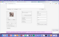
Using this style sheet, here is what my inbox looks like with beta testing turned on (click for full size):


To use it:
  • Install Stylus. It's available for Firefox, Chrome and Opera, and the main website with download links (in the top right) is here. NB the link for Opera doesn't seem to work, but I was able to install it in Opera by going to the Chrome store and just installing the Chrome version by clicking 'Add to Opera'.
  • Open the extension (in Opera: click the little Extensions cube icon in the top right, click on Stylus, click the Manage button. Probably similar in other browsers?).
  • Click the 'Write New Style' button.
  • Paste the below code into the big code box.
  • Change the drop-down at the bottom that says 'Everything' to 'URLs starting with' and enter https://www.dreamwidth.org/inbox. (This isn't essential; obviously if you apply the style to everything then it will be applied to the new inbox. But it might mess up stuff elsewhere, I don't know.)
  • Give the style a name, make sure the 'Enabled' box is ticked, and save it.
  • Admire your beautiful new-old inbox!

Click here to see the code
/* Set font size to 75% of the browser default */

body {
    font-size: 75%;
}

/* Make the buttons plain in colour and style */

.button.large {
    height: 20px;
    background-color: #efefef;
    color: black;
    border: 1px solid grey;
    font-size: small;
    padding: 0;
    cursor: auto;
    transition: none;
}

.button.logout {
    height: 20px;
    background-color: #efefef;
    color: black;
    border: 1px solid grey;
    font-size: small;
    cursor: auto;
    transition: none;
    border-radius: 2px;
}

.button.secondary {
    height: 20px;
    background-color: #efefef;
    color: black;
    border: 1px solid grey;
    font-size: small;
    cursor: auto;
    transition: none;
    border-radius: 2px;
}

@media only screen and (min-width: 40.0625em) { #account-links .logout.button {
    padding: 0 0.5rem;
    }}

.button.large:hover {
    background-color: #e5e5e5;
    color: black;
}

.button.logout:hover {
    background-color: #e5e5e5;
    color: black;
}

.button.secondary:hover {
    background-color: #e5e5e5;
    color: black;
}

.action_button.large {
    height: 20px;
    background-color: buttonface;
    color: black;
    border: 1px solid grey;
    font-size: small;
    padding: 0% 0.5em;
    cursor: auto;
    transition: none;
}

.action_button.large:hover {
    background-color: #e5e5e5;
}

/* Separate the list of folders on the left from the list of inbox items on the right, with a vertical line between them */

#inbox_folders {
    width: 100%;
    padding-right: 5%;
}

#inbox_folders ul {
    font-size: 100%;
    margin-right: 5%;
}

#inbox_messages {
    border-left: 1px solid silver;
    padding-left: 3%;
}

/* Restore the visual contrast between read and unread inbox items */

.item_read {
    color: silver;
}

.item_read a {
    color: silver;
}

.read {
    color: silver;
}

span.read:hover {
    color: black;
}

span.read:hover a {
    color: black;
}

.detail {
    color: #555;
}

.item_read .time {
    color: #555;
}

.inbox_item_row {
    cursor: pointer;
}

/* Return the header immediately above the inbox items to its old style as far as possible: a plain-coloured, smaller header with plain buttons for the numbered pages */

.searchhighlight {
    background-color: #dddddd;
    border-top: 1px solid #cccccc;
    border-bottom: 1px solid #cccccc;
    height: 2.5em;
}

#action_row {
    padding: 0.2em 0.5em;
}

ul.pagination li {
    background-color: #efefef;
    color: black;
    border: 1px solid grey;
}

ul.pagination li a {
    padding: 0 5px;
    font-weight: normal;
    color: black;
    transition: none;
    height: 100%;
}

ul.pagination li a:visited {
    color: black;
}

ul.pagination li.current a {
    background-color: #cccccc;
    font-weight: normal;
    color: black;
    cursor: pointer;
    border-radius: 0px;
}

ul.pagination li.current a:visited {
    background-color: #cccccc;
    font-weight: normal;
    color: black;
}

/* Return the list of inbox folders to its old style as far as possible */

.folders a {
    color: black;
    border: 1px solid #f5f5f5;
}

.folders a:hover {
    background-color: #eeeeee;
    border: 1px solid #bbbbbb;
}

.folders li {
    width: 100%;
    border: 1px solid white;
    list-style-type: none;
}

ul li ul {
    margin-left: 0;
    max-width: 86%;
}

/* Widen margins to where they were before */

#page {
    max-width: 80%;
}

.row {
    max-width: 100%;
}

#content {
    max-width: 100%;
}

#logo {
    margin-left: 29%;
    margin-bottom: 20em;
}

/* Return the top banner to its old appearance */

#masthead {
    height: 8.7em;
    border-top: 0.45em solid #f4d2fc;
}

#account-links-wrapper {
    margin: -2em auto;
}

#account-links-text {
    margin-top: 1.5em;
}

@media only screen and (min-width: 40.0625em) { #account-links ul {
    font-size: 100%;
    }}

@media only screen and (min-width: 40.0625em) {
#account-links .ljuser {
    font-size: 1.5em;
    }}

#canvas {
    border-width: 2em 0;
}

/* Miscellaneous tweaks */

h1 {
    font-size: 2em;
}

.top-bar-section ul li>a {
    font-size: 75%;
}

@media only screen and (min-width: 40.0625em) { .top-bar-section .has-dropdown>a:after {
    display: none;
}}

.nav-search select {
    font-size: 75%;
    background-color: white;
}

.top-bar-section .dropdown {
    min-width: 12em;
}

#search {
    border: 1px solid #767676;
    transition: none;
    border-radius: 2px;
    width: 15em;
    height: 1.75em;
}

#search:hover {
    border: 1px solid #4f4f4f;
}

This code fixes several of the things that were making the new inbox look cluttered and overwhelming for me. It:
  • Returns the font size to 75% of the browser default.
  • Widens the margins back to where they used to be.
  • Restores the visual contrast between read and unread inbox items.
  • Separates the list of folders and the inbox contents with some more space and a vertical line, as before.
  • Makes buttons smaller and plainer, as they were before.
  • Returns the list of folders to its old, plainer appearance.

It was designed for use with the Tropospherical (Red or Purple) site skins. From a brief perusal of the others, it seems to look mostly OK with Celerity and Lynx; with either of the Gradation skins, you'll want to change the color: black; line under .folders a to color: white; or something else other than black, because that bit makes the text in the folder links invisible.

There are comments (between the /* */s) explaining what each part of the code does, so if you want some of these fixes but you like other features of the new inbox and would prefer to keep them, you can remove parts of it as you please.

Things it doesn't do:
  • I've improved the appearance of the numbered page buttons, but I can't do anything about the fact that there are multiple numbered page buttons instead of just 'next' and 'previous'.
  • I can't do anything about the single buttons that switch from 'mark all read' and 'delete all' to 'mark read/unread' and 'delete' on selecting something, instead of separate buttons for individual/all.
  • For some reason the margins of the top banner and the main inbox section don't quite line up, as they do in the old Inbox. This is probably fixable with the right CSS knowledge, but I had a moderately big headache getting the margins to move at all and have decided to leave it here for now!

I am very much not an expert in this kind of thing! Beyond briefly testing the different site skins, I don't know how this will interact with different browsers, screen sizes/resolutions, access needs, aesthetic tastes etc., and there may not be a huge amount I can do about any problems. That said, I want to help people, and if you find the new inbox unusable and this doesn't work for you either, let me know and we'll see if we can figure out how to make it work better. :) Likewise, any advice from people who know more about CSS than I do is very welcome.

I have made an effort to do something similar for the new Create Entries page. Here I think the actual structure of the page is too different to be able to achieve much, and I've not got very far, but I have managed to make it a little more tolerable; I'll probably do a bit more tinkering and see how it goes and may share the results here. In any case, the unmodified new Inbox was definitely the worse of the two for me, so I'm fairly pleased with having achieved this much.

And it's been pretty good fun figuring out Stylus. I have learnt quite a bit more about CSS, I have learnt to use Inspect Element properly instead of occasionally briefly clicking in there to check some HTML and then running away from all the scary-looking code lines, and actually, being able to modify the look of anything anywhere on the internet is very satisfying. I find Youtube's 'recommended videos' in the sidebar while I'm trying to watch a video distracting? No problem, I can just get rid of them! I decide I don't like Tumblr blue? It's green now! Maybe I'll fix Wikipedia's hideous new mobile-friendly layout next.

June 2025

S M T W T F S
123 4567
891011 121314
15161718192021
22232425262728
2930     

Syndicate

RSS Atom

Style Credit

Expand Cut Tags

No cut tags
Page generated Jun. 17th, 2025 10:55 pm
Powered by Dreamwidth Studios